|
|
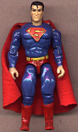
Old: Ugggg, what was I thinking using gloss paints. Ugggggg |
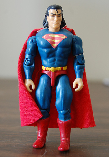
New: Flat paint looks much better. Better "S" chest symbol. Sculpted Supes some longer hair, looks MUCH better. |
Custom Superhero Comparison
While I wasn't ashamed of the job I did on these the first go around some 5-6 years ago, I thought they needed some "tweaking"
|
|
Old: Ugggg, what was I thinking using gloss paints. Ugggggg |
New: Flat paint looks much better. Better "S" chest symbol. Sculpted Supes some longer hair, looks MUCH better. |
|
|
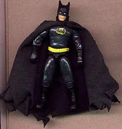
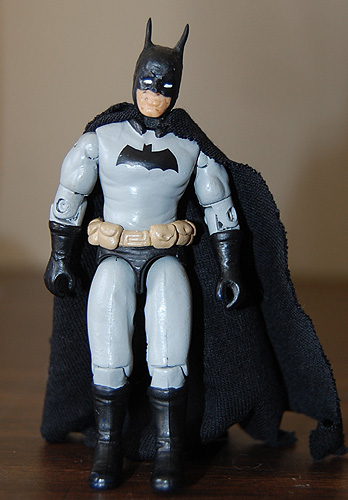
| Old: Again, ugggg with the gloss and too dark of gray paint, the symbol and ears look terrible. | New: Like Supes above, flat paint looks much better. More of a early Dark Knight look. Sculpted pockets on the belt and ears from epoxy are vast improvements over original. Cape is bigger and fuller. |
|
|
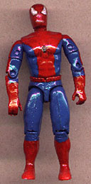
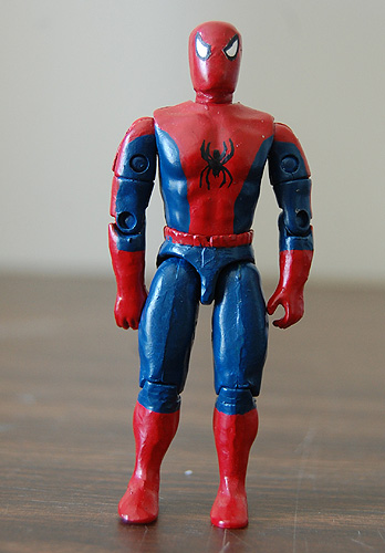
| Old. Man, that gloss is nasty, and they eyes are way off center. | New: Nicer flat paint. Better shade of blue, eyes are centered and the spider on the chest is much better. |